Medium Format Forum

Register a free account now!

If you are registered, you get access to the members only section, can participate in the buy & sell second hand forum and last but not least you can reserve your preferred username before someone else takes it.

Snowin' in Tennessee

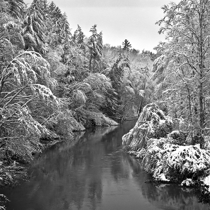
Some winters we don't get any snow in Middle Tennessee, but this year we've been "lucky."
It's the same image sent twice, once @ a Jpeg Quality 12, and the other @ Quality 5. I'm curious to see if there is a difference once posted online.

501 CM
100/3.5 CF Planar
T-Max 100 scanned via Nikon LS-9000 ED (what I refer to as a "poor man's Imacon").

Michael H. Cothran

After posting them, and viewing even the larger versions, I honestly don't see any difference, so henceforth I'll post the smaller size jpegs.
Let me know if you see a difference on your monitor. Otherwise, I hope you enjoy the image.
 

Attachments

  • 82.4 High.jpg
    EXIF
    82.4 High.jpg
    493.2 KB · Views: 54
  • 82.4.jpg
    EXIF
    82.4.jpg
    197 KB · Views: 44
  • 82.4 High.jpg
    EXIF
    82.4 High.jpg
    493.2 KB · Views: 54
  • 82.4.jpg
    EXIF
    82.4.jpg
    197 KB · Views: 42
there is a difference

on my screen the upper image has better contrast. Its better. i tested it on my wife also and she came to the same conclusio without me influencing.
I am always very suspicious to jpg compression.
 
I pulled both images into Photoshop so I could view them side-by-side at 100%. I agree with Birger, the High version has more contrast. But frankly, I was surprised at how close the images looked.....I expected more of a difference.

Beautiful image by the way! I'm sure you must be enjoying the beauty of unexpected winter snowfalls. Snowing here this morning also....we got another 10 inches overnight.

It's great unless you have to be out driving on slippery, snow clogged roads.

Gary
 
They come up side by side on my iMac (24"), and there is quite a difference. The smaller image is more contrasty and at first glance more appealing, but you can see more details in the larger one. I hate having to reduce my images to jpeg, it stuffs them up in my opinion.
 
They come up side by side on my iMac (24"), and there is quite a difference. The smaller image is more contrasty and at first glance more appealing, but you can see more details in the larger one. I hate having to reduce my images to jpeg, it stuffs them up in my opinion.

They come up side by side on my 24" Viewsonic monitor also, but not at full resolution. If I click on each image, they will open into a sort of pop-up/overlay window and if I click on the image there, it will display at full resolution....but then I can't see each image side-by-side....which is why I opened them in Photoshop.

When they are just viewed on the web page as it normally displays (before clicking to display the full res image)....there really isn't much difference on my monitor between the two images.

I'd love to see the original full resolution image or a print! :)

Gary
 
I have a three monitor setup 1 x 19" and 2 x 24"
I opened the images in two windows. The Higher resolution images does show more resolution and better tonality especially in the water.
 
jpeg contrast

I am a bit surprised that the jpeg conversion not only affects resolution but also contrast and tonality. I hate the jpeg artifacts but when using at lowest compression i cant see the difference or is there? I mean if you use JPEG at least possible compression the quality one can see on the screen even when zoomin in is remarcably similar to a tiff version and still the file is much smaller. So the trick to my mind is to set everything to compression level 10 to 12 (max quality) and forget about all the loer (=harder) compressions. At early internet days it was a point to compress the images carefully for using them on the net. But now its to my mind less importent. Any oppinions?
I agree a nice picture! Here (Oslo) we had snow for months and i am starting to long for the less contrasty motives without snow.
 
Upper image...

Michael --

The upper image appears to have a slight bit more contrast than the second image as I view them.

The real test to me would be a print of this lovely image...have you printed this yet?? I can only imagine that the detail is fantastic...would like to see this printed at about 12x12 or 20x20. Well done...look forward to more from this outing.

Best regards -- Bishop
 
Thanks to all who have replied. Base on your observations, I will continue to post at the highest resolution ( jpeg - Quality 12, 10"x10" @ 72 ppi).

Bishop - for my Art & Craft show sales, I made prints last night of 6x6", 12x12", and 24x24". They all look fine, but the 24" shows some noticeable grain in the sky, which I don't understand, as this was T-Max 100 film. I can't detect it on the actual film, but it might have been introduced, or augmented, in the scanning process (Nikon LS 9000 ED). I've been able to smooth it out to a degree, but it's still there.

Note - This is the very first b&w film scan I have ever done. I did three more over the weekend, and none have the noticeable grain of this one. I may try to re-scan it. Advice from anyone on this forum who scans b&w film would be appreciated. What is the preferred working space once scanned? I normally use Pro Photo RGB.

O well, as Michael Reichmann (Luminous Landscape) always says - "I'd rather have grainy and sharp than creamy and blury!"

Michael H. Cothran
 
RGB color space for BW

I have scanned a few films in greyscale but i have the feeling its not recommendable and that desaturated rgb scans give slightly better tones. but i cant really make up my mind on this. have to do more testing. i posted a question about this in the didgital darkroom section under photoshop thread....
 
Back
Top