Hi,
we will post from time to time some articles in a series called "Have you seen...?". The purpose of this series is to show and explain some features of the forum software and of the new template we use now for some days already. We will not explain every feature, only the 5-10 most important features.
Today I start with the colours of the background. In the past (and with most websites this is still the case today) you were limited to only one template with one specific colour as the background. So the admin had to make the decision whether the forum runs with a light background colour (which is better for reading text at daylight) or with a dark background colour (which is better for displaying images or reading at night).
This was always either-or, never both. And the admin, not the users decided this. So some users were happy, others were not. It was always a compromise, no matter what the admin installed.
This has changed now. At least in this community forum
With our new template we are not anymore restricted to one background colour. We do offer both at the same time. Even better, you can switch back and fourth with one click, no matter how often. So from now on, you decide whether you prefer to use this forum with a light background or with a dark background.
What do you have to do?
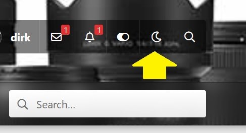
Simply click on the upper right hand corner (or alternatively at the buttom on the left) on the "moon-symbol" and the background will switch immediately to the dark mode. If you click again after that on the same spot on the light-bulb (it replaces the moon), you switch immediately again to the light background. Simple as that. Try it yourself.

But even if you prefer the light background, you can see the image only on a dark background, if you click on its thumbnail (if the image is bigger than the size of the thumbnail). See it yourself and click on the image above.
we will post from time to time some articles in a series called "Have you seen...?". The purpose of this series is to show and explain some features of the forum software and of the new template we use now for some days already. We will not explain every feature, only the 5-10 most important features.
Today I start with the colours of the background. In the past (and with most websites this is still the case today) you were limited to only one template with one specific colour as the background. So the admin had to make the decision whether the forum runs with a light background colour (which is better for reading text at daylight) or with a dark background colour (which is better for displaying images or reading at night).
This was always either-or, never both. And the admin, not the users decided this. So some users were happy, others were not. It was always a compromise, no matter what the admin installed.
This has changed now. At least in this community forum
With our new template we are not anymore restricted to one background colour. We do offer both at the same time. Even better, you can switch back and fourth with one click, no matter how often. So from now on, you decide whether you prefer to use this forum with a light background or with a dark background.
What do you have to do?
Simply click on the upper right hand corner (or alternatively at the buttom on the left) on the "moon-symbol" and the background will switch immediately to the dark mode. If you click again after that on the same spot on the light-bulb (it replaces the moon), you switch immediately again to the light background. Simple as that. Try it yourself.

But even if you prefer the light background, you can see the image only on a dark background, if you click on its thumbnail (if the image is bigger than the size of the thumbnail). See it yourself and click on the image above.