If you are registered, you get access to the members only section, can participate in the buy & sell second hand forum and last but not least you can reserve your preferred username before someone else takes it.
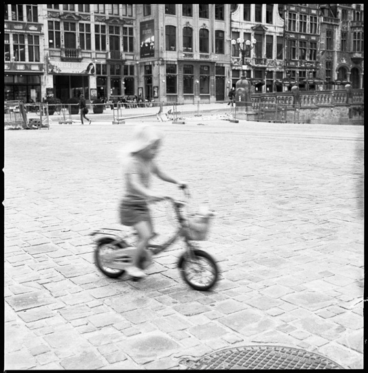
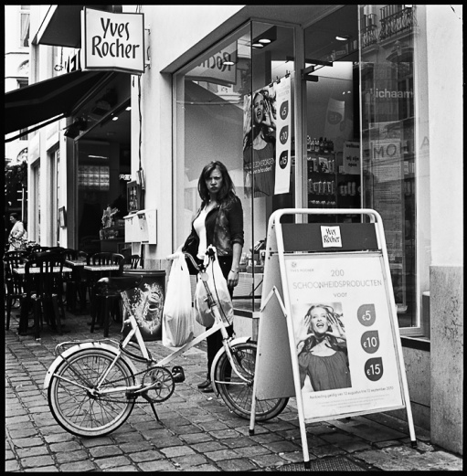
I like both pictures very much although they are completely different. The first has something trashy in it. The only negative touch is the modern ad in front.
Te second is absolutely stunning, it's dynamic a gives a really retro touch with the matching old houses in the background. The slight overexposure gives the pictures something light.
This site uses cookies to help personalise content, tailor your experience and to keep you logged in if you register.
By continuing to use this site, you are consenting to our use of cookies.